Color Palette Analysis
BY HEEEY
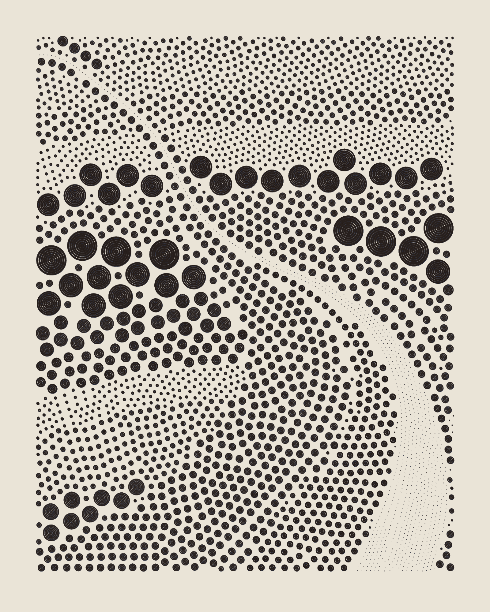
Color palettes in QQL are complex and multifaceted. Unlike most other long-form generative artworks, each QQL color palette has multiple backgrounds and doesn’t usually make use of all colors, but rather a selection of the available colors. This means that outputs from the same palette may actually share no common colors at all.
However, each palette has a distinctive and unique feeling. Same-palette colors have a shared tone or vibe that make them work well together in the same seed, or even when compared side-by-side in different seeds. Colors are meant to connect and combine in pairs or groups. When they are all viewed together, they often share tones or show a clear hue progression.
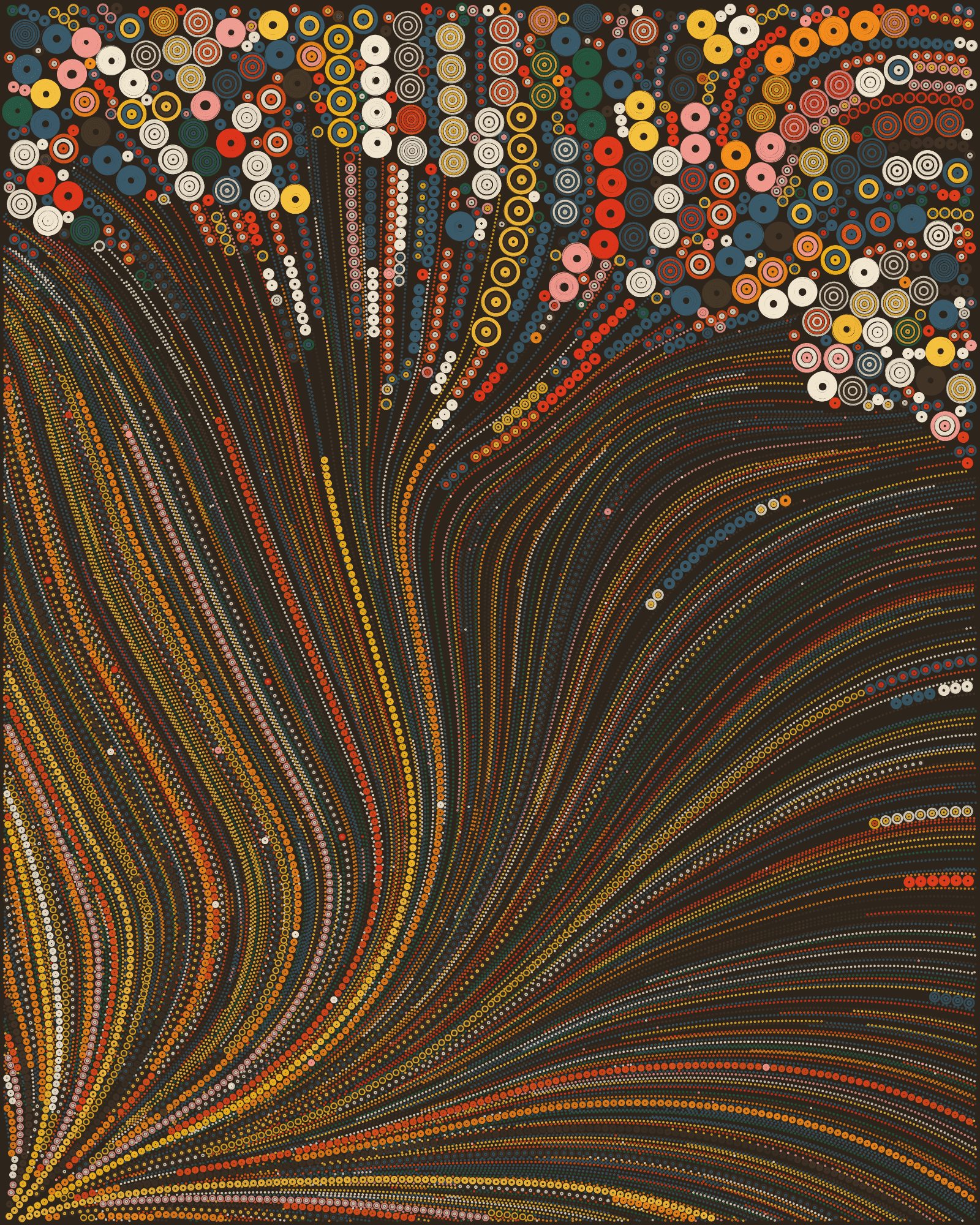
In QQL there are seven palettes. The Fidenza palette takes its name from the acclaimed generative art collection of the same name, released on Art Blocks Curated in 2021. This namesake project actually originally took its name from the city of Fidenza, in Italy. The other six palettes in QQL are named for other cities: Austin, Berlin, Edinburgh, Miami, Seattle and Seoul.
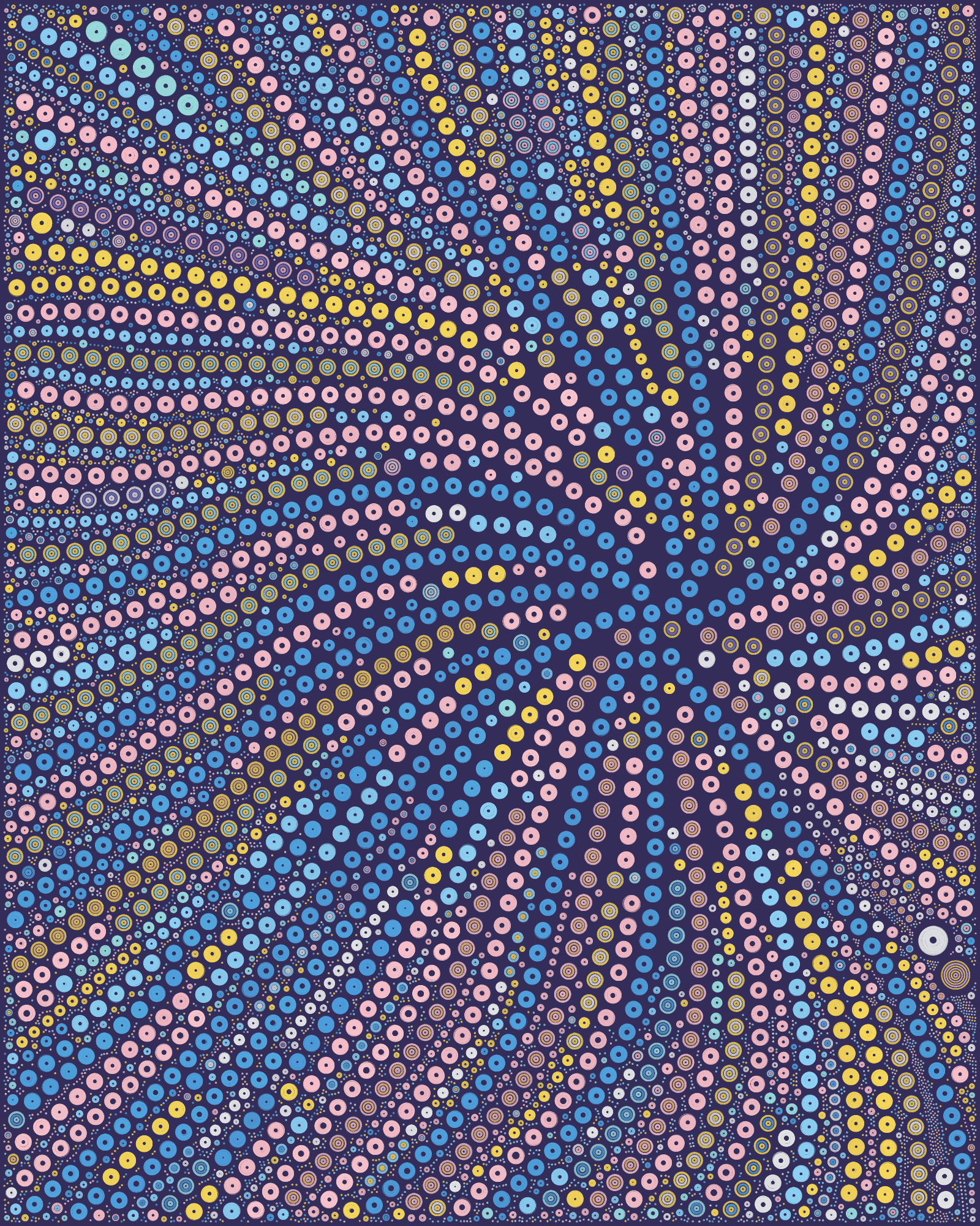
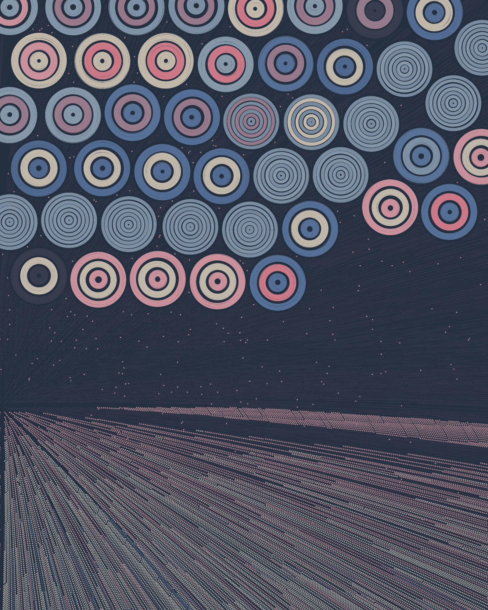
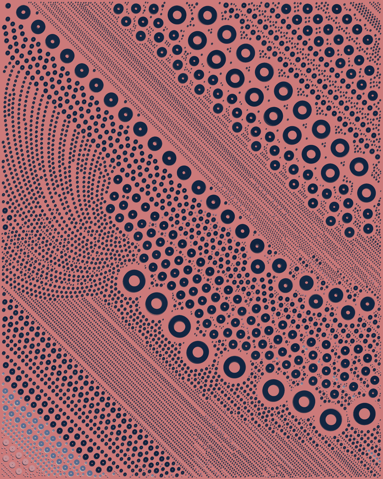
Fidenza

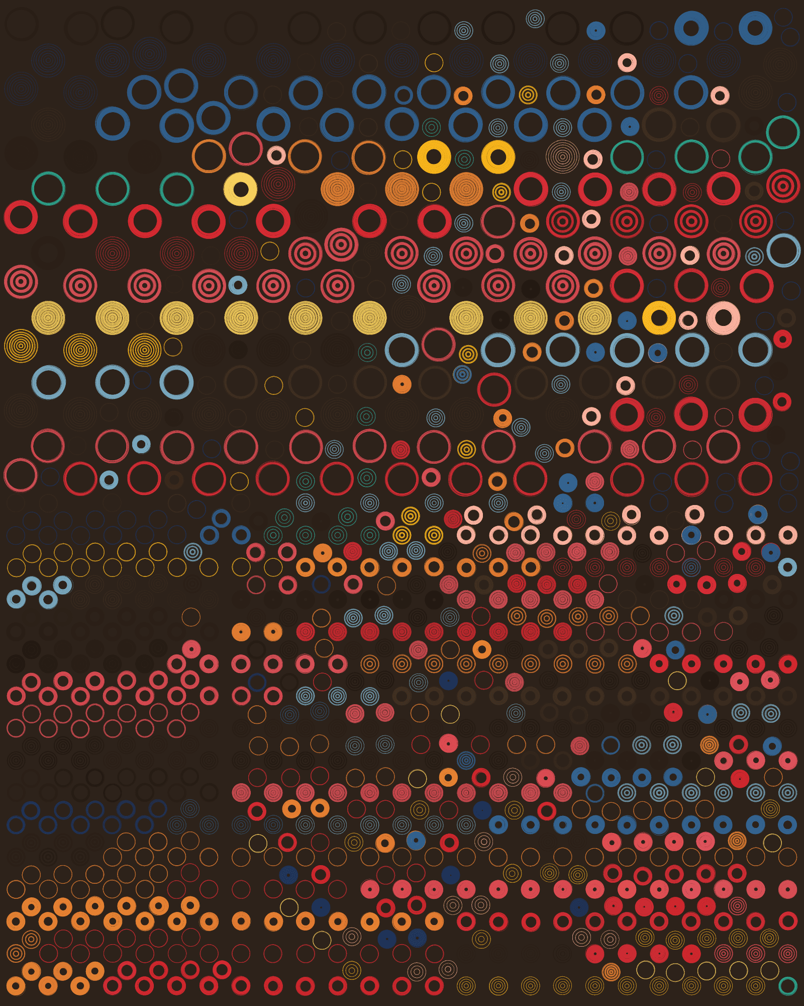
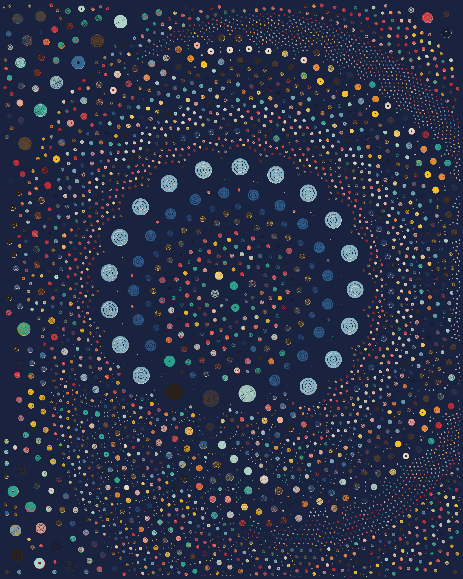
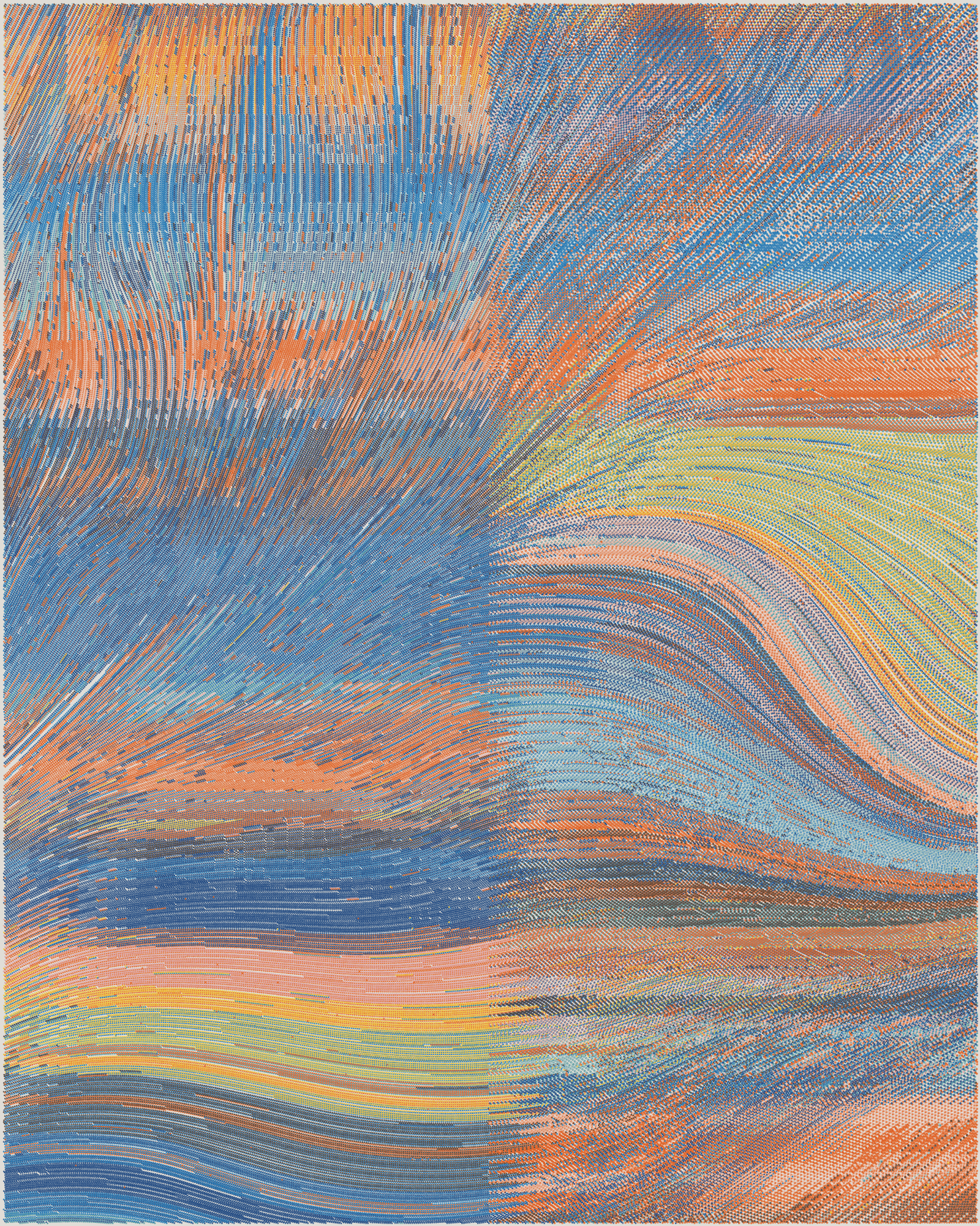
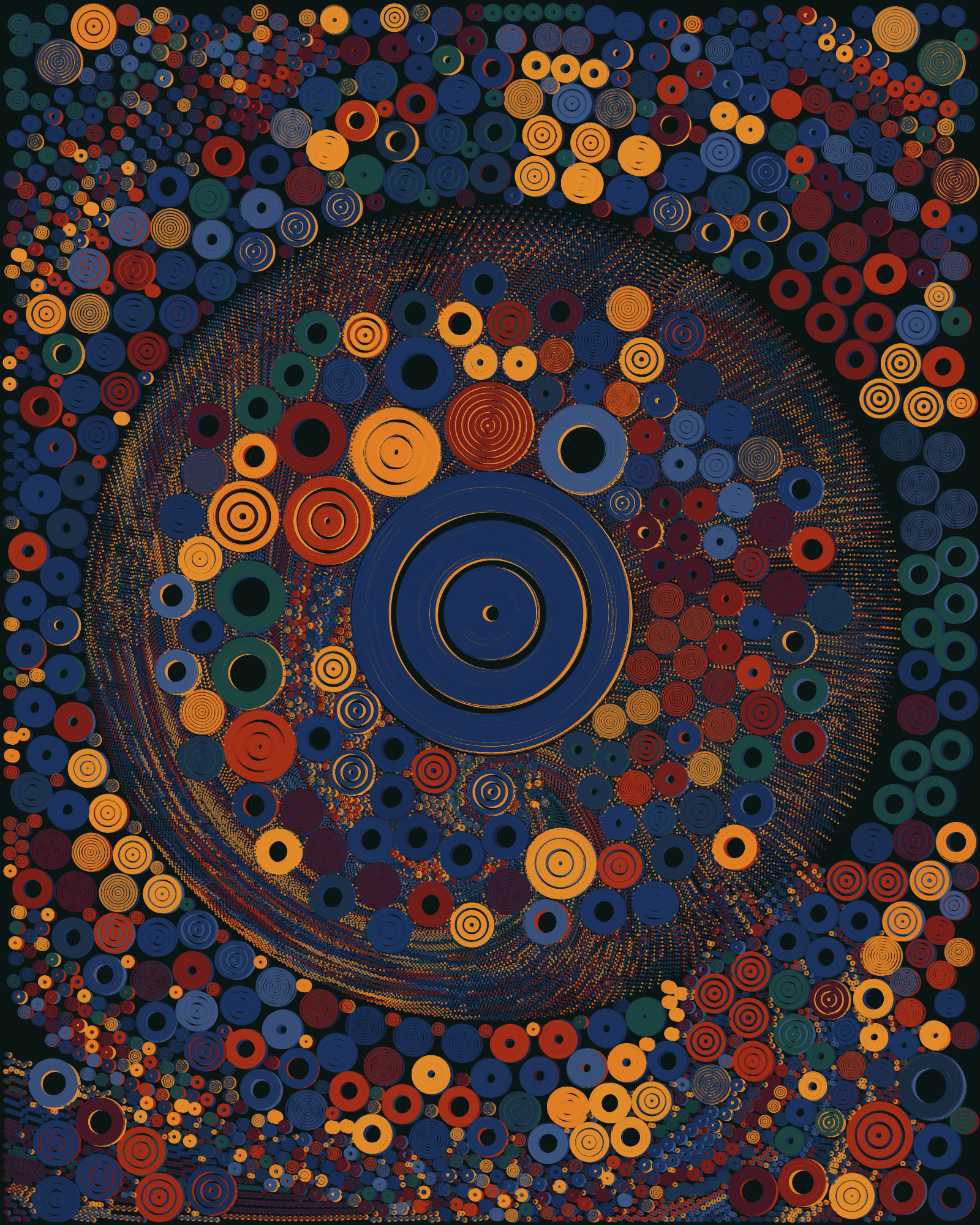
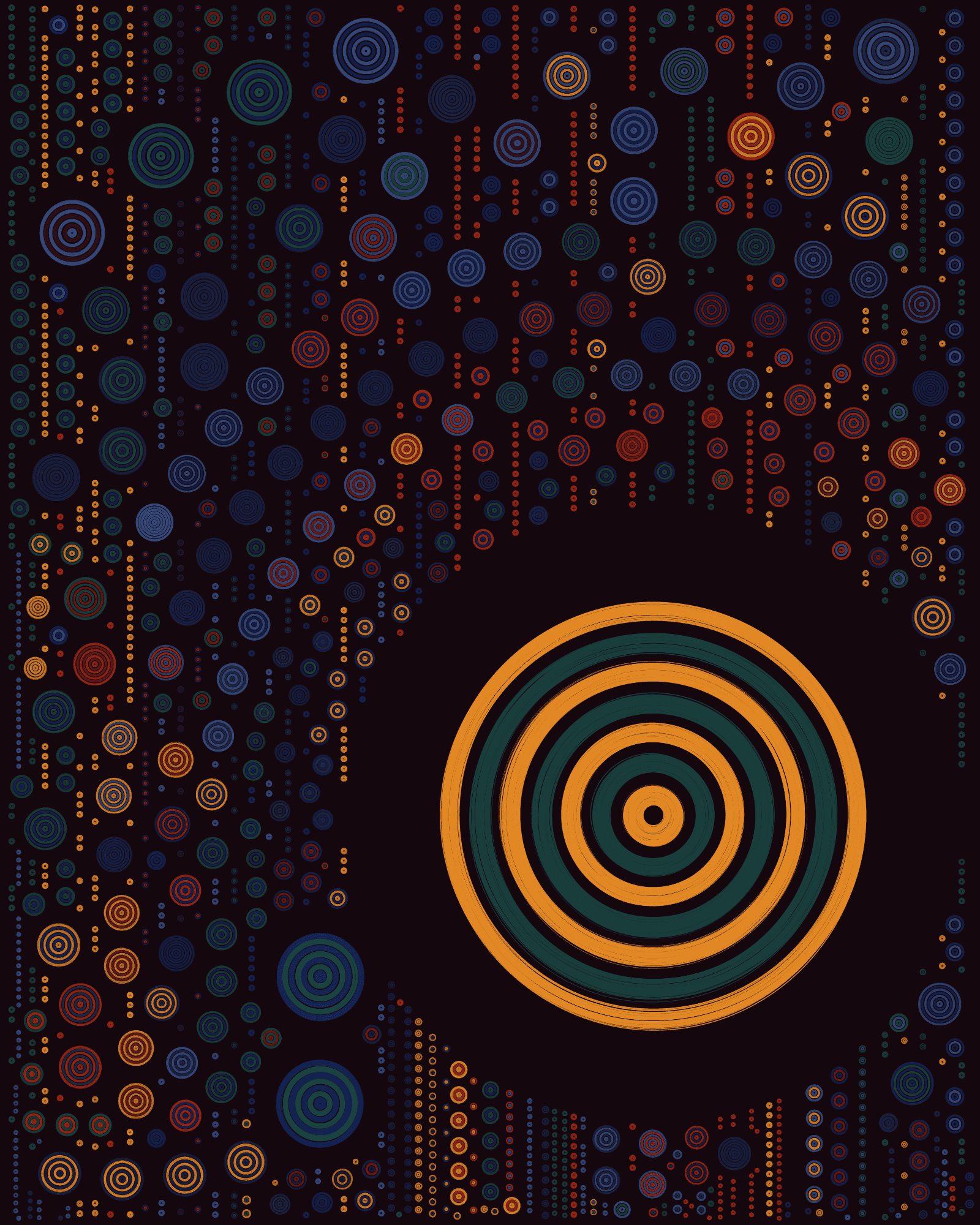
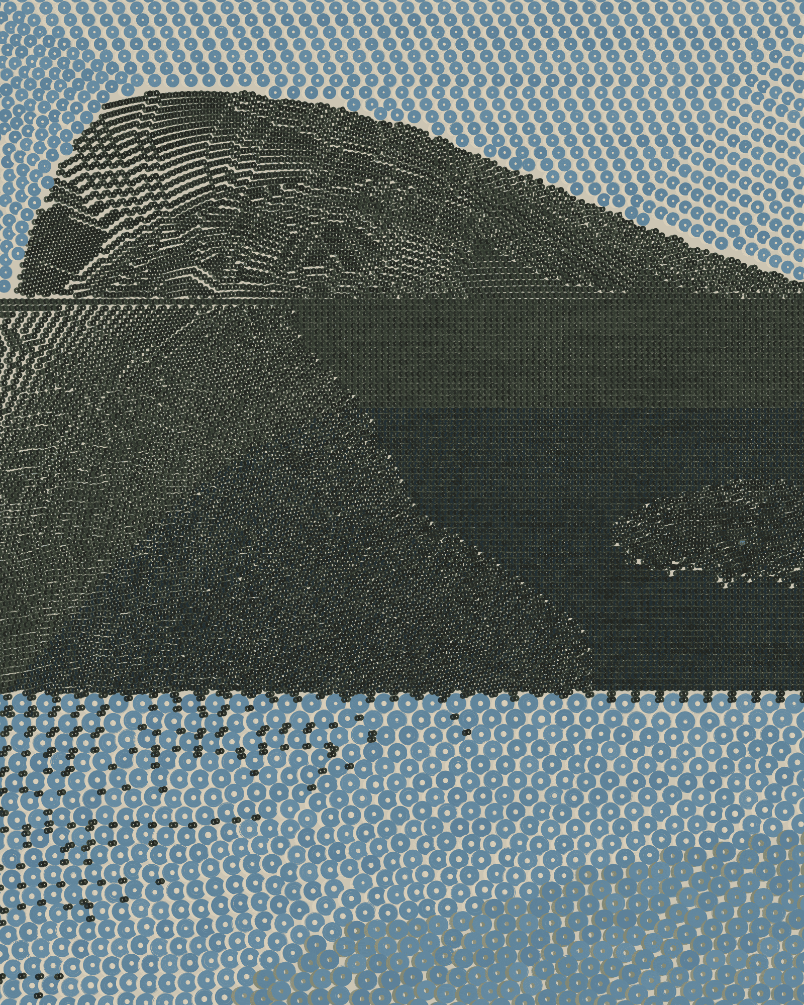
The Fidenza palette has been the most popular color palette in QQL to date, as almost half the first 300 works in the collection use it. It’s the most diverse palette, featuring more unique colors and a larger chromatic range than any other palette. Colors used in Fidenza have been featured in and evolved across several of Tyler’s works, starting at least as far back as 2017 in the “Where the Wind Went” series, and appearing in many more works in the years that followed. This evolving color palette culminated in the “Luxe” color palette in the Fidenza in 2021, and we can find a very close connection between the “Luxe” palette and QQL’s “Fidenza” palette.

In the Fidenza palette, we find a “gradient” of similar-toned vibrant and very versatile colors (red, orange, yellow, green and blue) that make the backbone of the palette. These are accompanied by a set of lighter and darker counterparts that provide a proportioned sense of contrast throughout.
“Full-color” seeds are the best example of this. We can find these in many different textures, depending on ring thickness, size and quantity, but the visual result is very pleasant and well balanced.
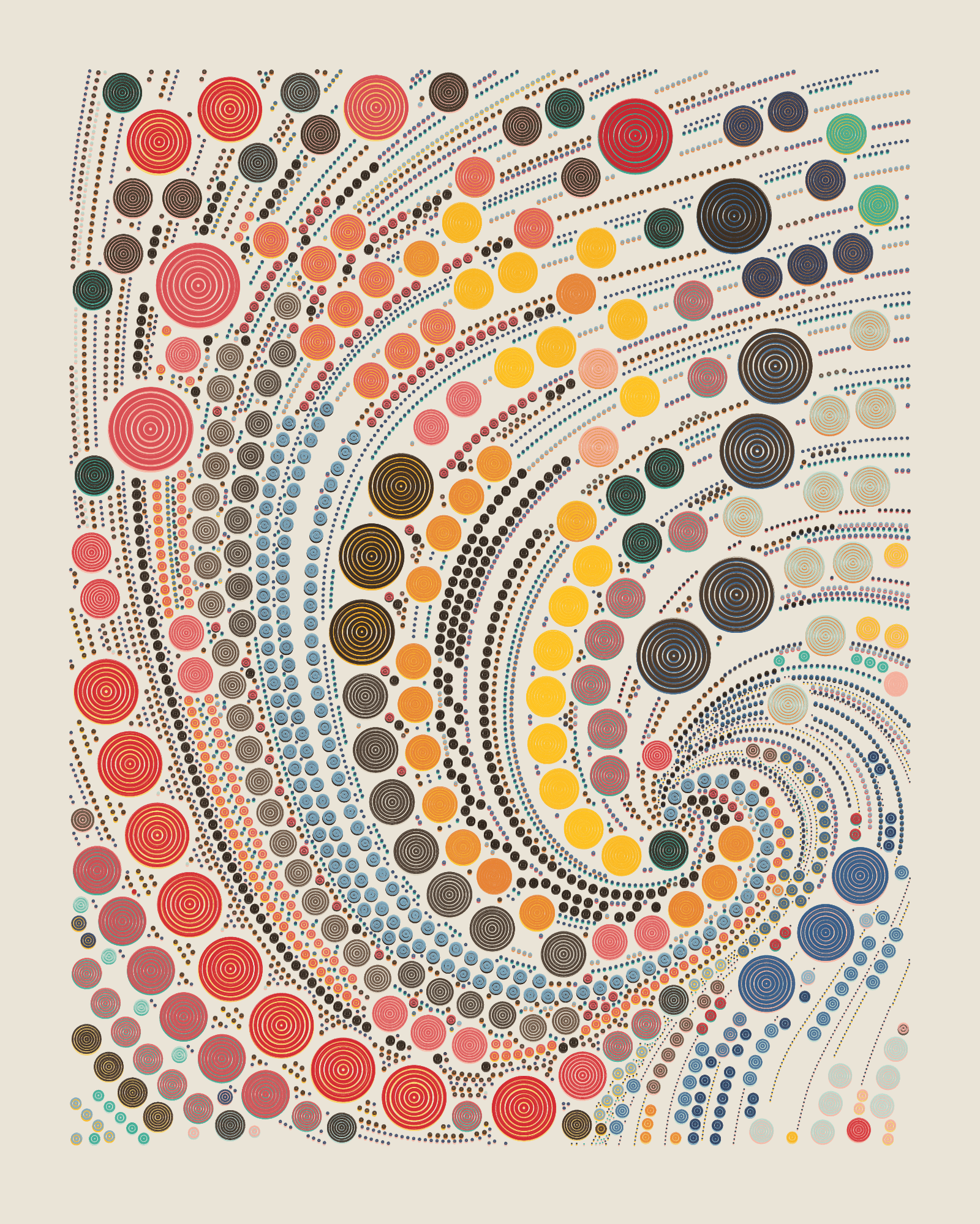
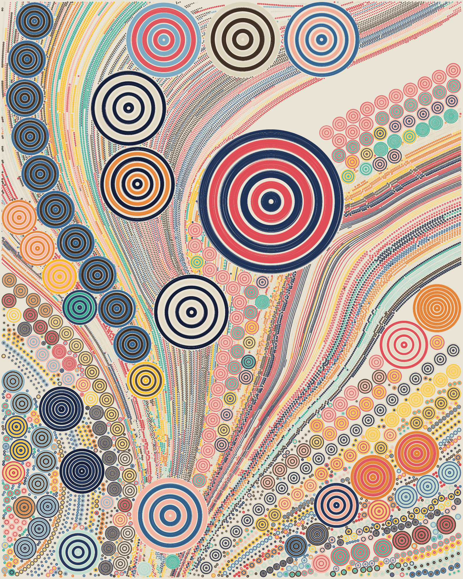
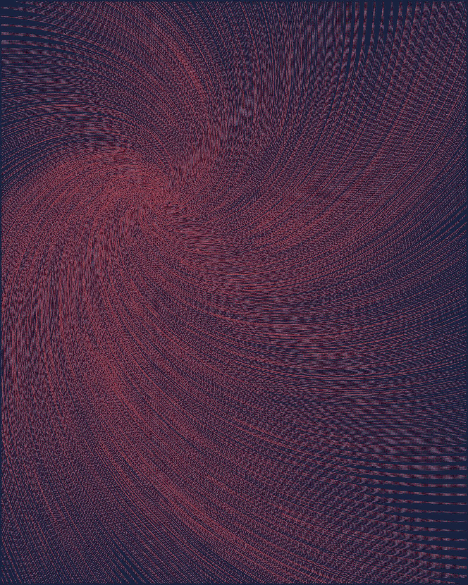
Looking at seeds with lower color variety, we can find countless combinations, from desaturated rings with soft pastel undertones and beautiful luminosity, to tight, analog-gradient textures. All colors in the palette can render on their own, generating, for instance, “black and white” seeds, or any other possible monochromatic arrangement, where ring color yields to composition.
Darker backgrounds can show Fidenza colors in a different light, allowing rings to pop in a richer, deeper and more intense way. These dark backgrounds can often create a captivating visual dynamic where the darkness acts as a void, allowing the inherent luminosity of the colors within the rings to truly shine.
Edinburgh

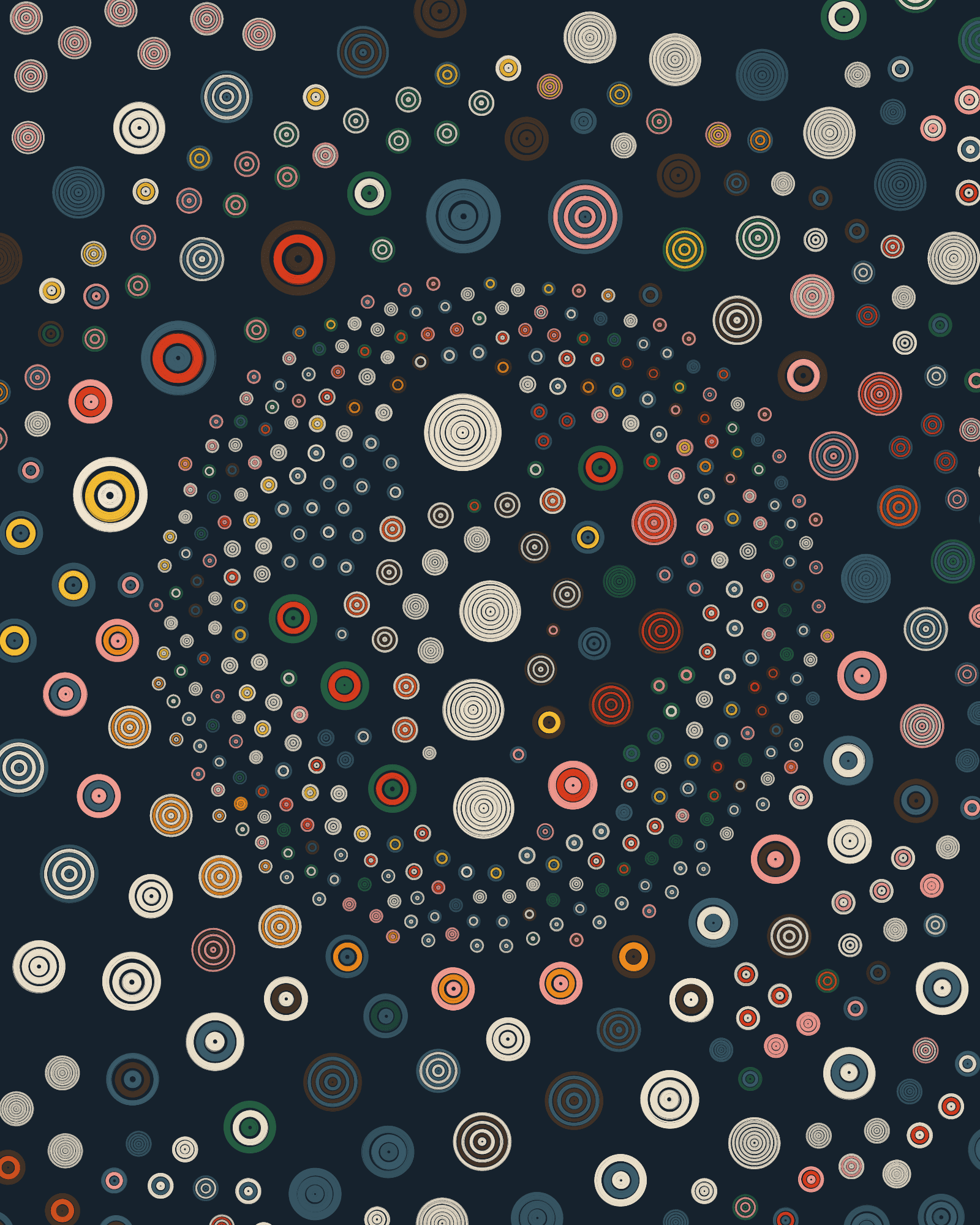
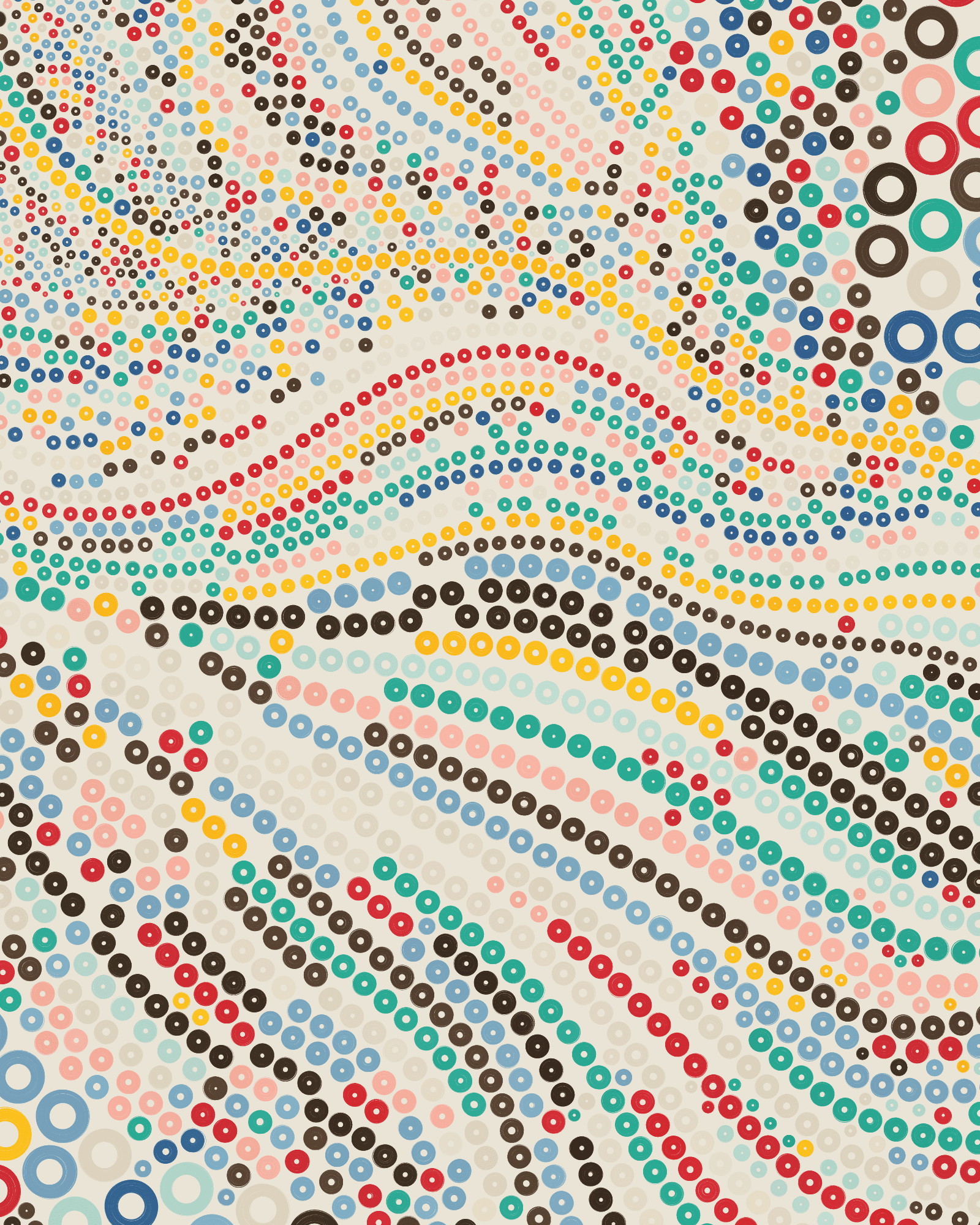
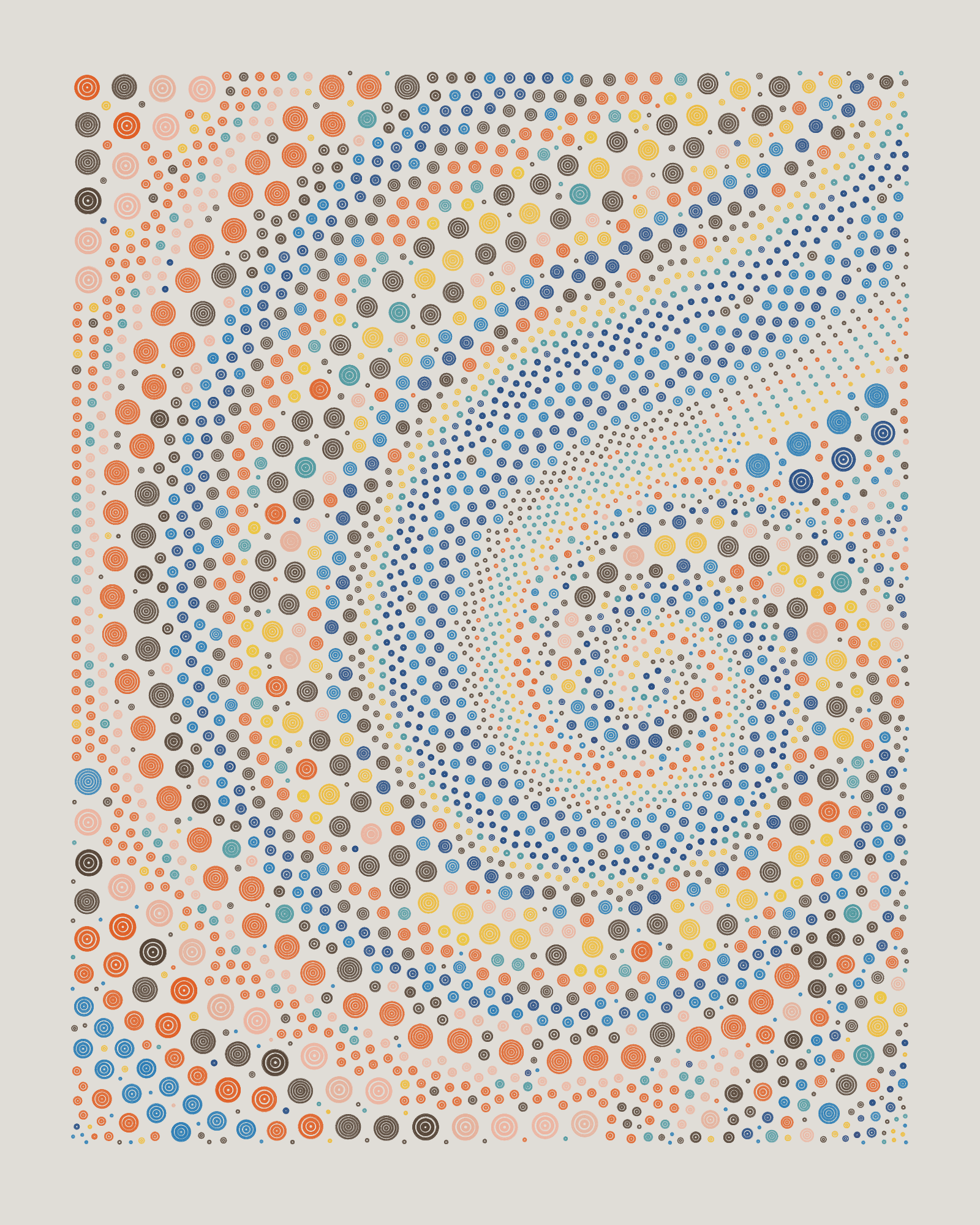
Edinburgh is an earthy color palette with mostly warm rings and backgrounds that combine with a few stronger tones. After Fidenza, Edinburgh is the palette that can generate the most chromatically diverse outputs that, in general, have a sophisticated and elegant feeling.
Vivid orange-red rings contrast nicely with the more muted tones throughout the rest of the palette while the combination of “Edinburgh Cream” with “Edinburgh Blue” can produce the most “black and white” looking seeds in all of QQL.

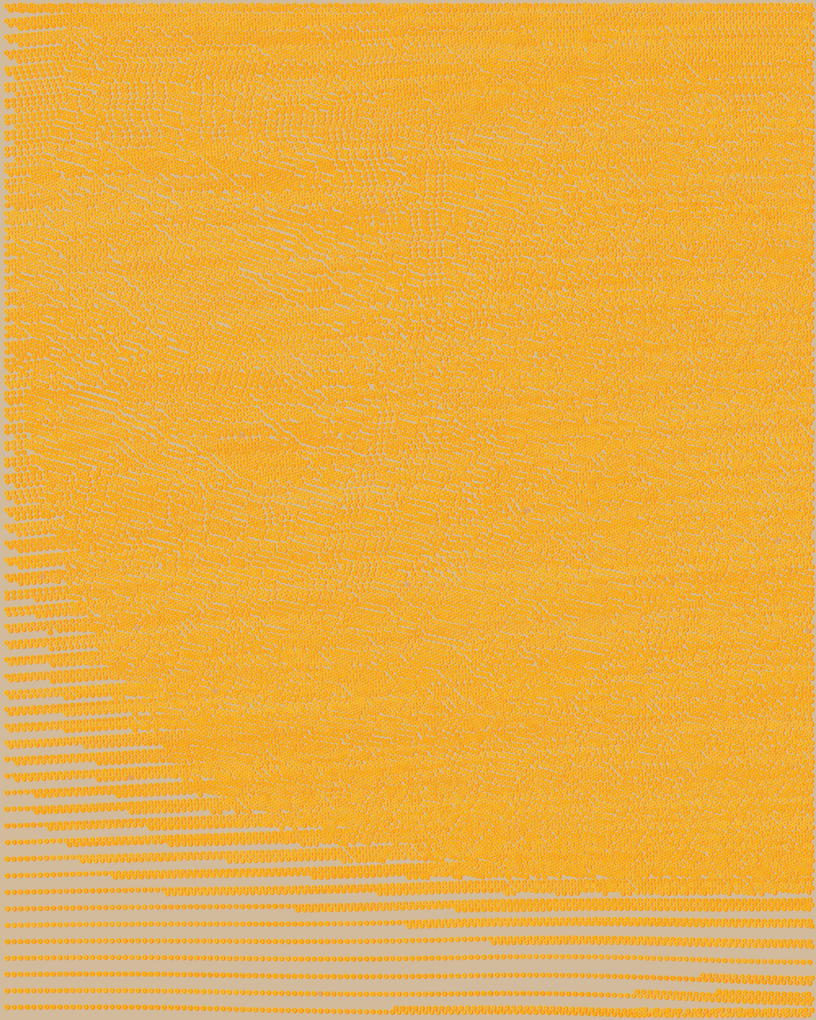
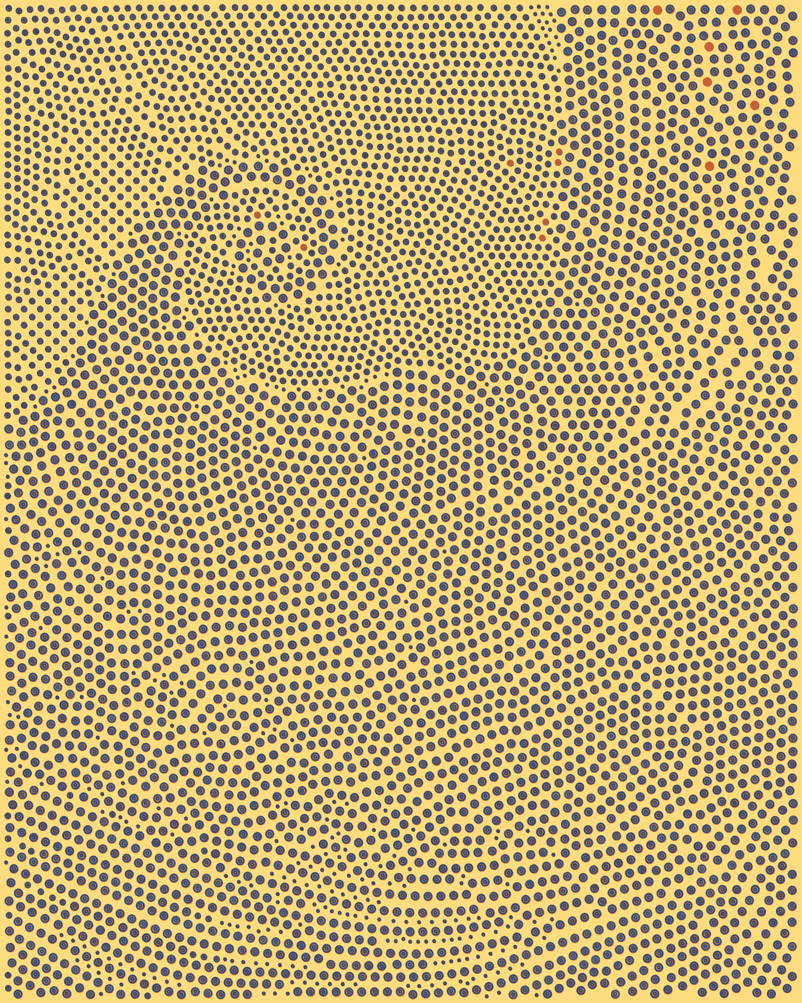
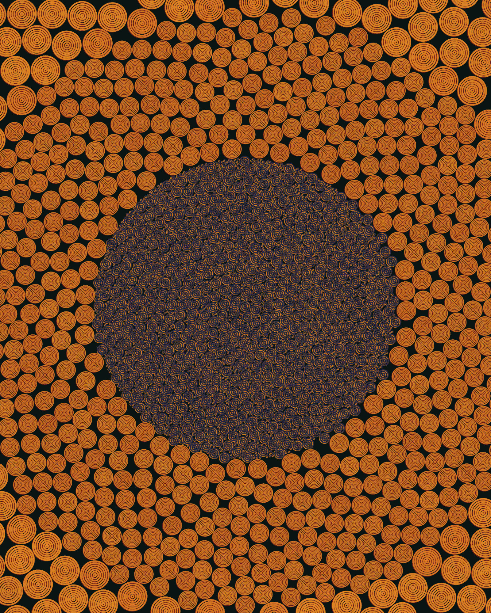
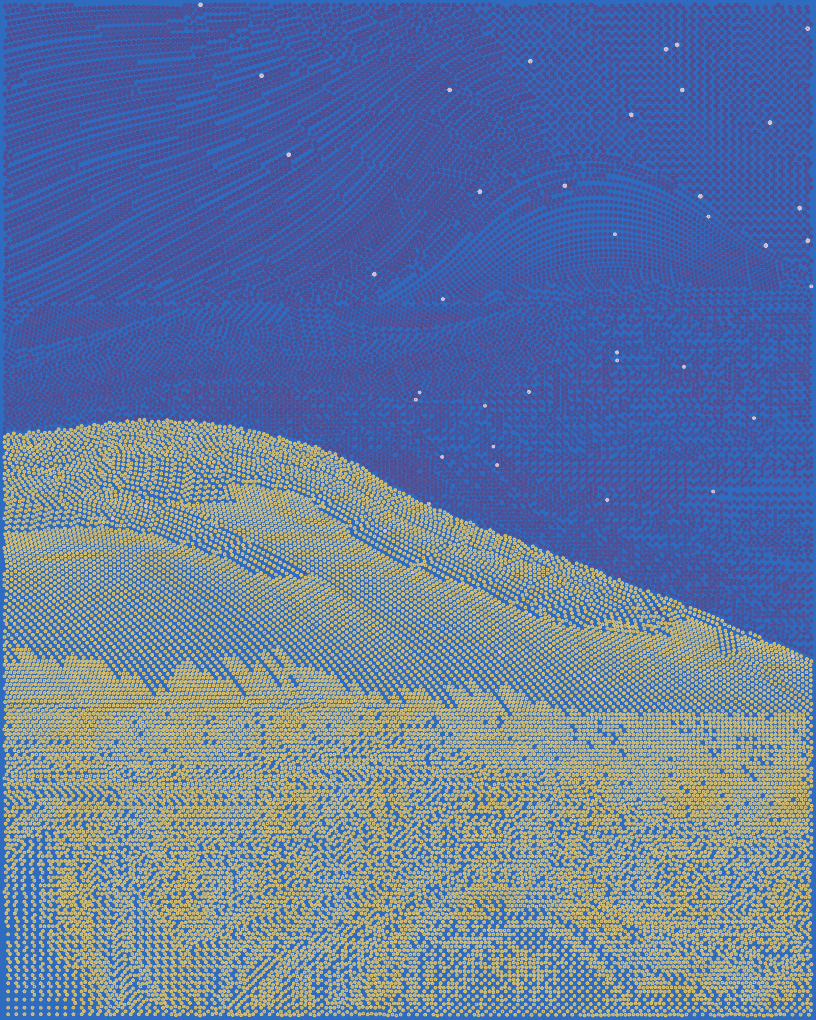
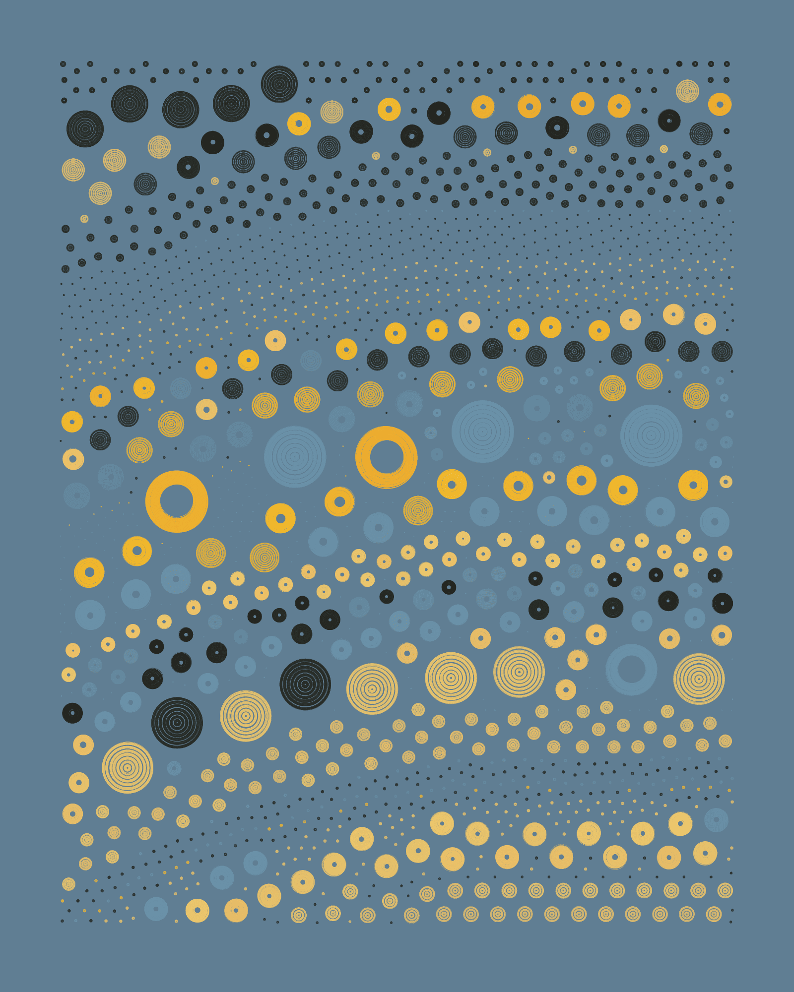
Austin


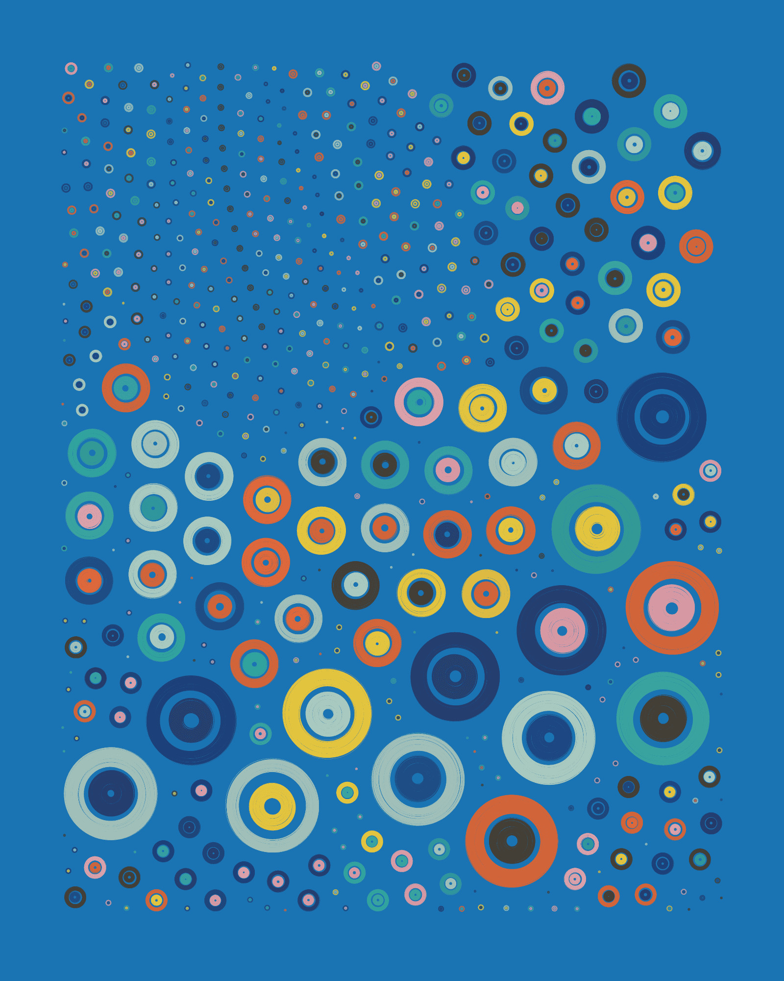
The Austin palette is undeniably bold and energetic, characterized by the strong presence of intense yellow, orange, and blue rings. These are central to the palette’s aesthetics, and establish its lively character. They also stand out over the rest of the colors in the palette. The saturation and prominence of these three colors create a visually striking and dynamic combination.
When the yellow, blue or green background appear, the resulting outputs are visually intense. This high level of color saturation throughout background and foreground generates a powerful and expansive visual experience for the viewer, which is why these seeds feel immersive, almost three-dimensional, as if the rings were moving slightly across the canvas.
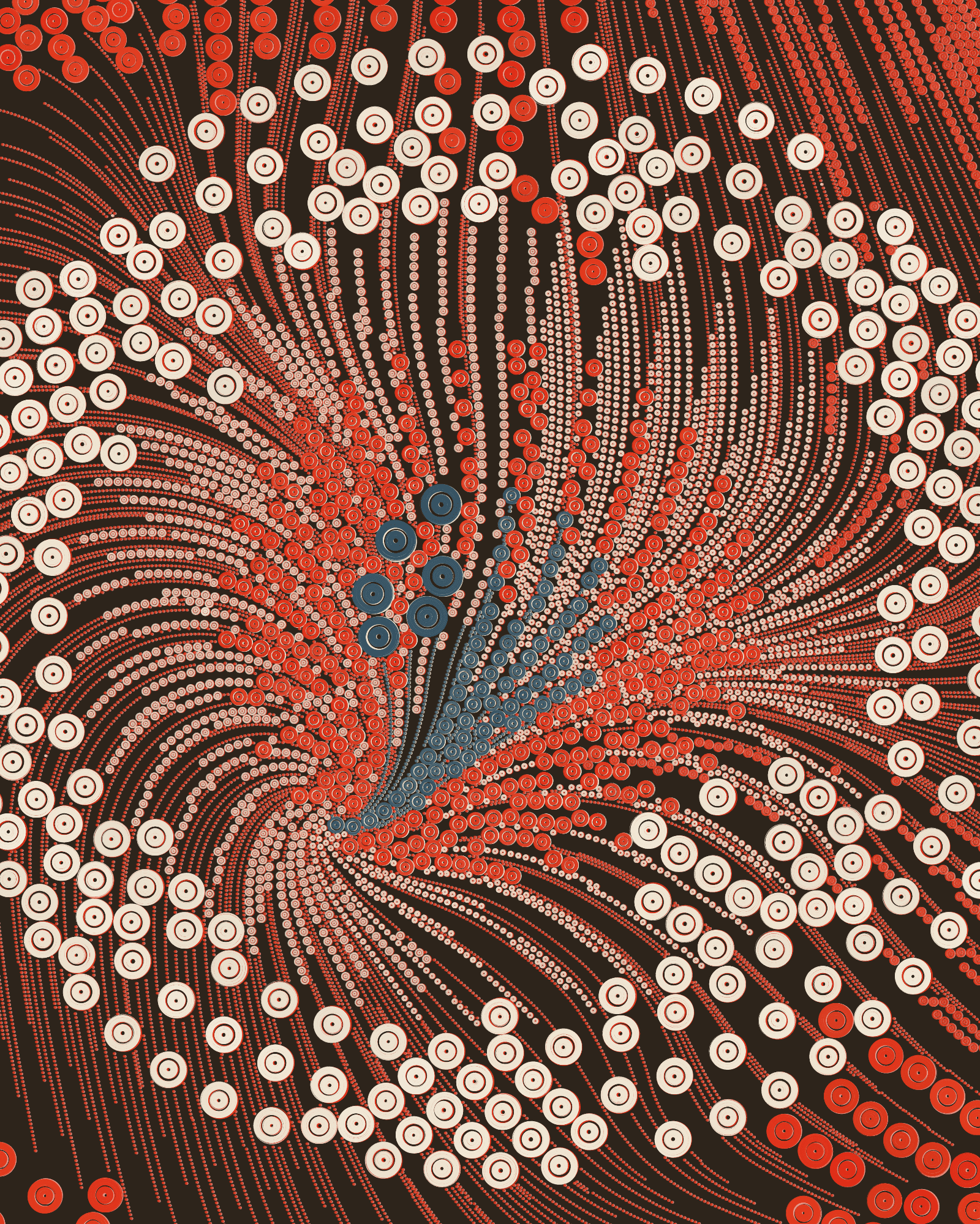
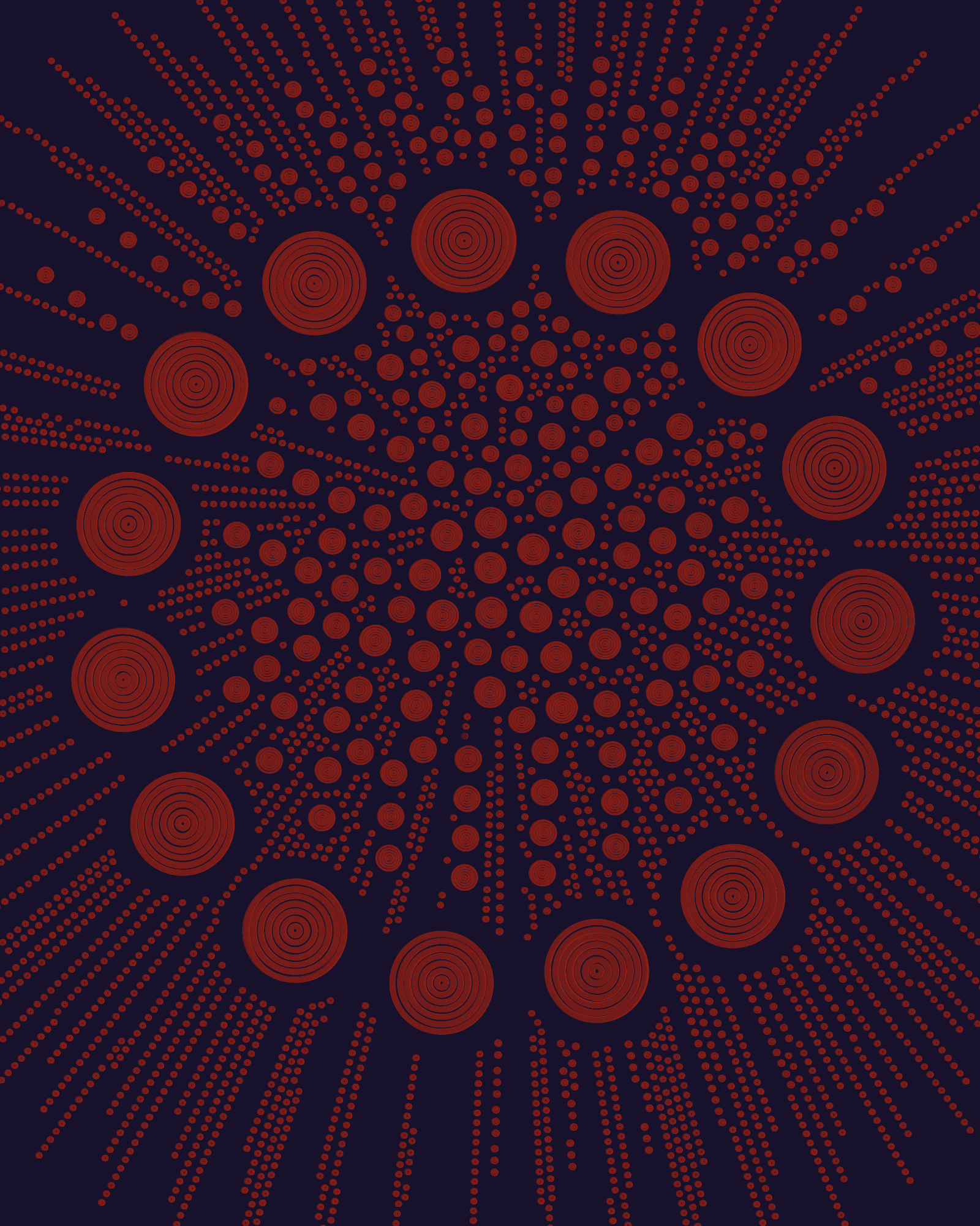
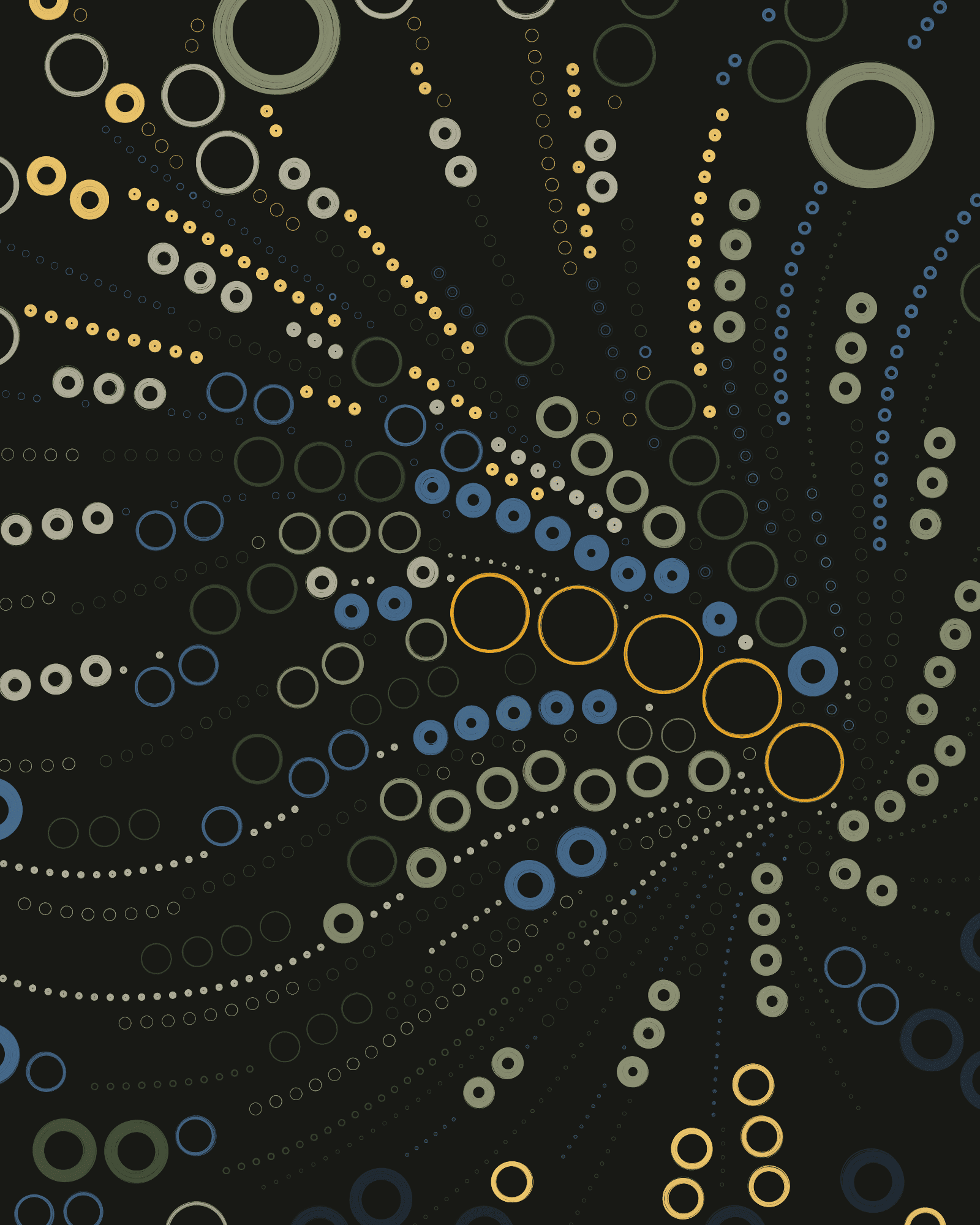
Berlin

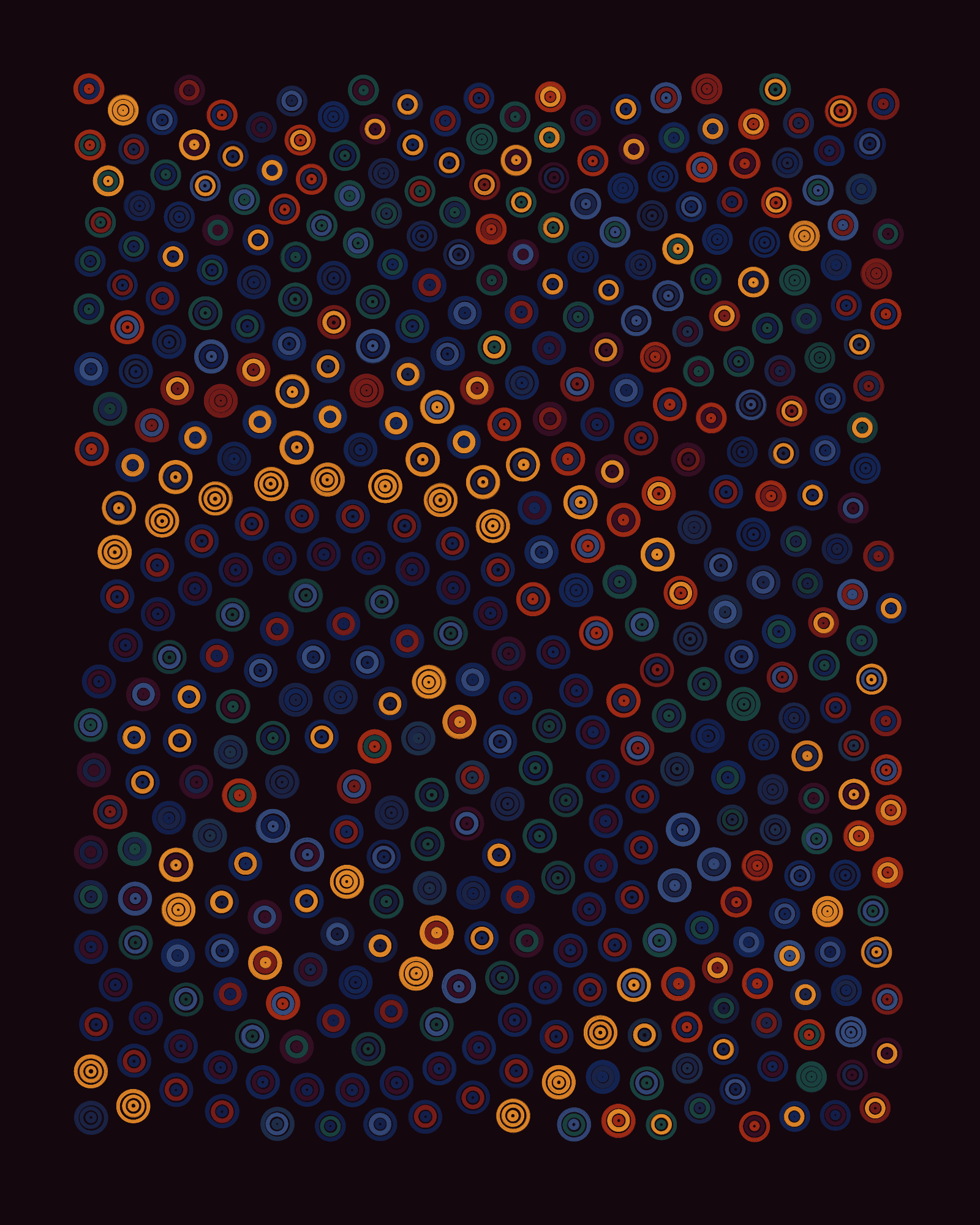
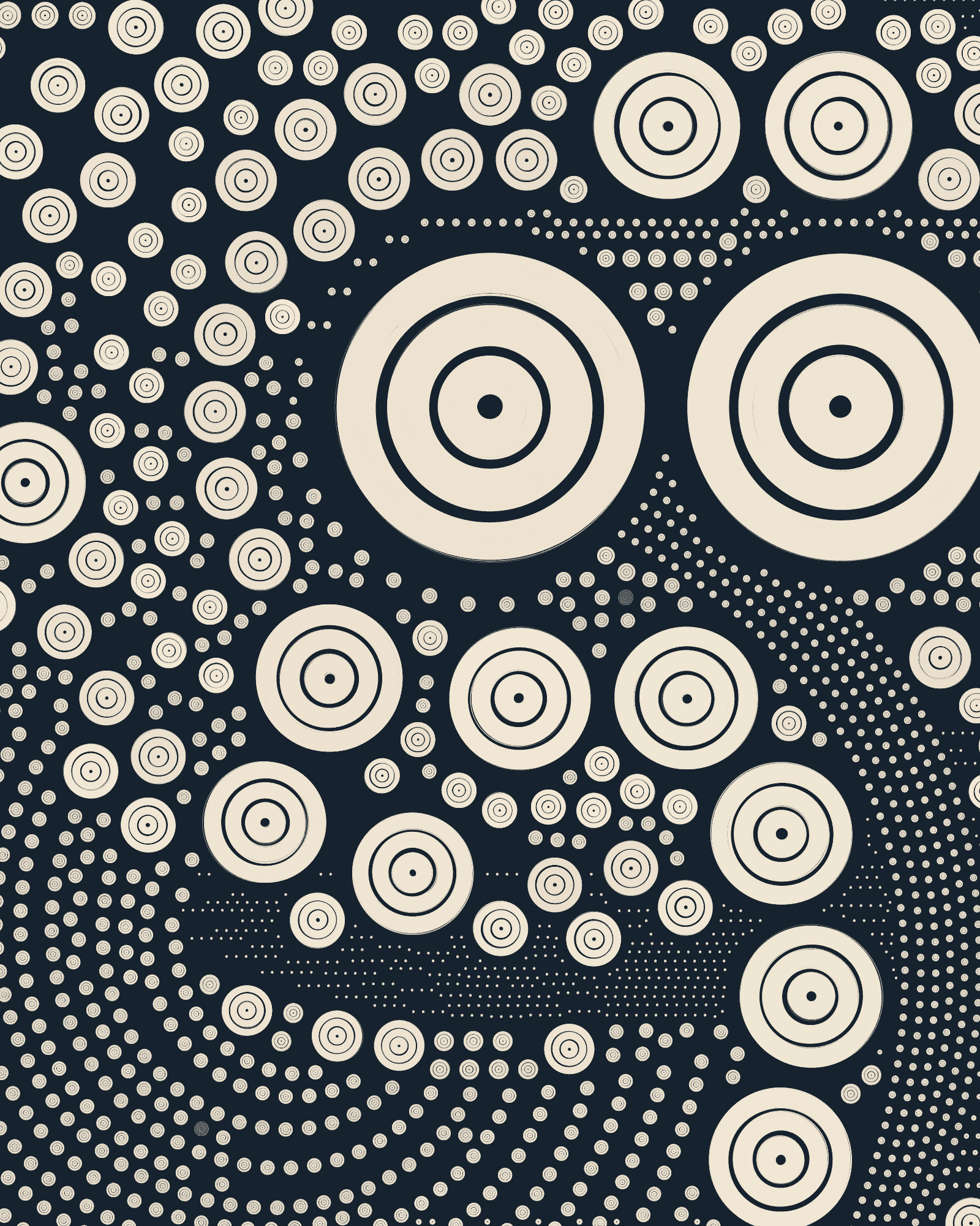
Berlin is the darkest palette, and it’s the only QQL palette where all its backgrounds are dark. Most of its ring colors have low brightness too, making its seeds look exceptionally dramatic. Specifically, the “Berlin Dim Orange” color has a strong presence, serving as a beacon of light among the prevalent darkness. There are some reds and blues that, with their intermediate brightness, serve as a point of connection between the golden tones of “Berlin Dim Orange” and dimness of the rest of Berlin’s visual space.
When orange is the main color in a seed, we discover a different version of Berlin altogether where darkness becomes the contrasting element in the canvas and not the other way around. It’s this play between light and darkness that makes Berlin a strikingly deep palette. In absence of orange, we find subtle seeds that make their constant soft tones their strength.

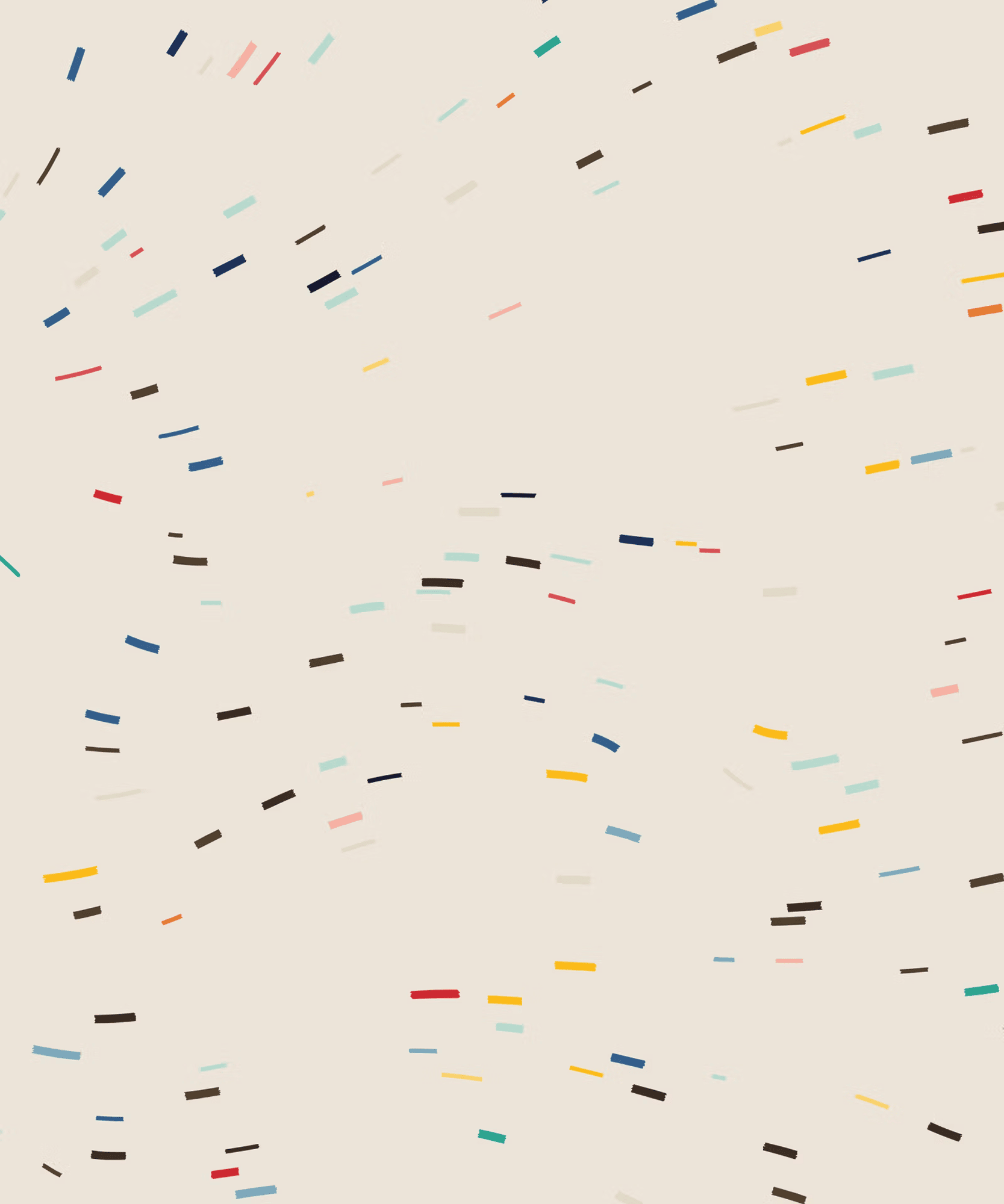
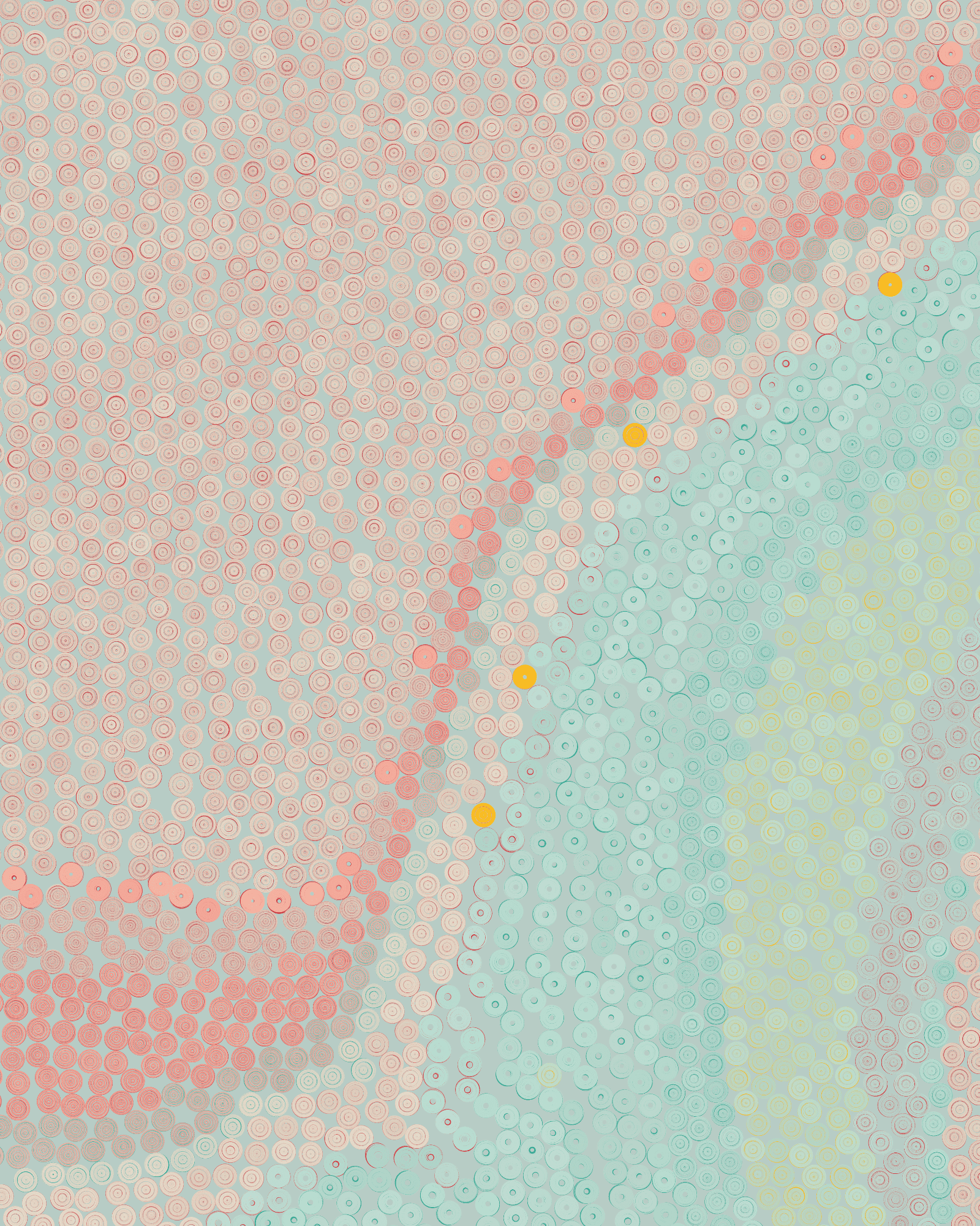
Miami

Miami is bright with all its colors being radiant and full of light. These work well in unison, producing seeds that look cheerful, that are constant in tone and very straightforward and satisfying. No single color stands out from the rest. However, it’s still possible to find contrast in this palette through the “Miami Dark Purple” background, which is the only dark color present in the whole palette. This background generates a lively counterbalance that make the luminous ring colors pop.
The “Miami Rich Blue” background may also produce interesting mid-contrast results, with the lighter rings in the palette tinting the blue background and producing interesting combinations.
Other remarkable results we can find in Miami seeds are the very light pastel, almost creamy, tones of thin small rings on a white background, and the neon-like qualities of seeds that combine pink, orange, light blue and green.
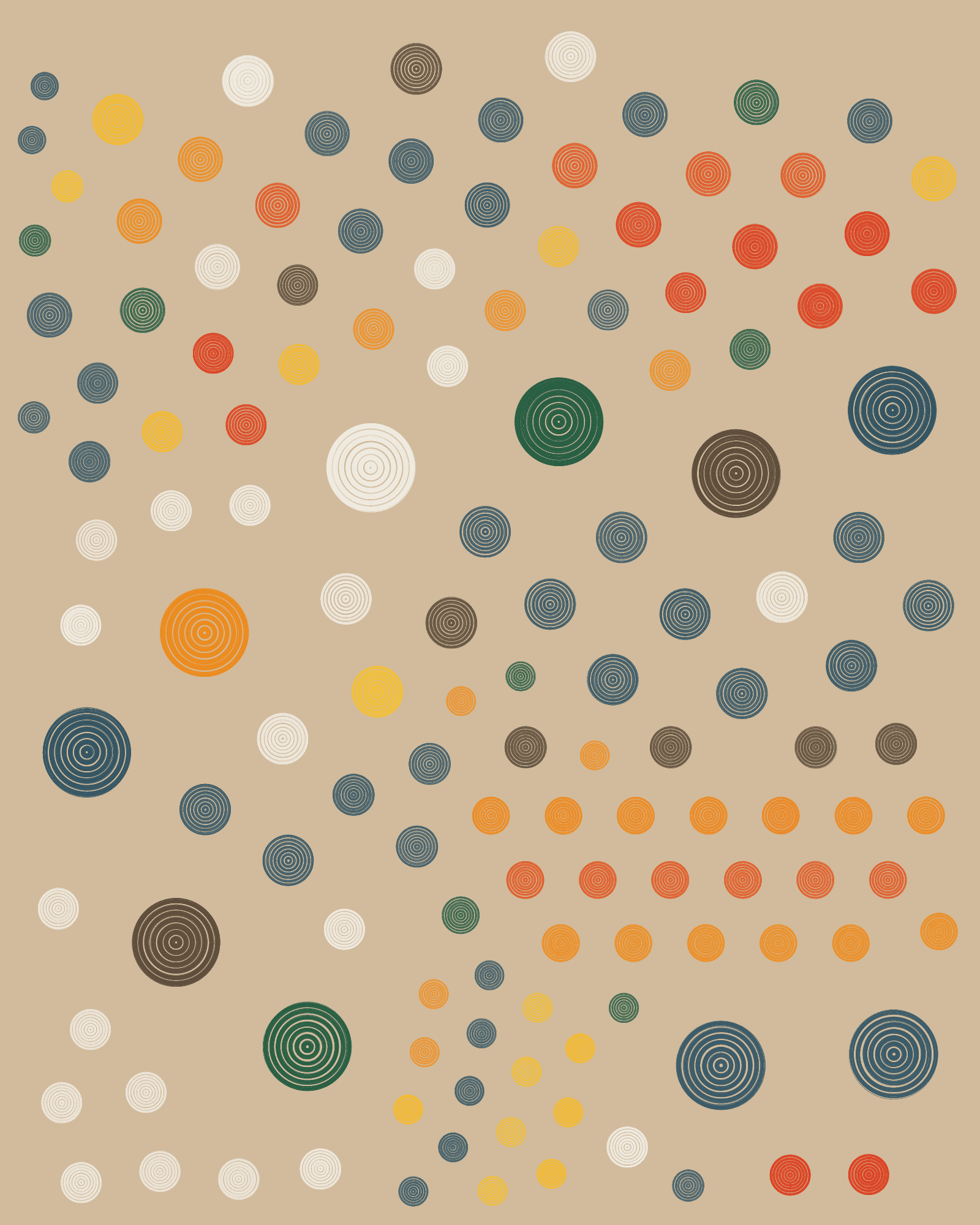
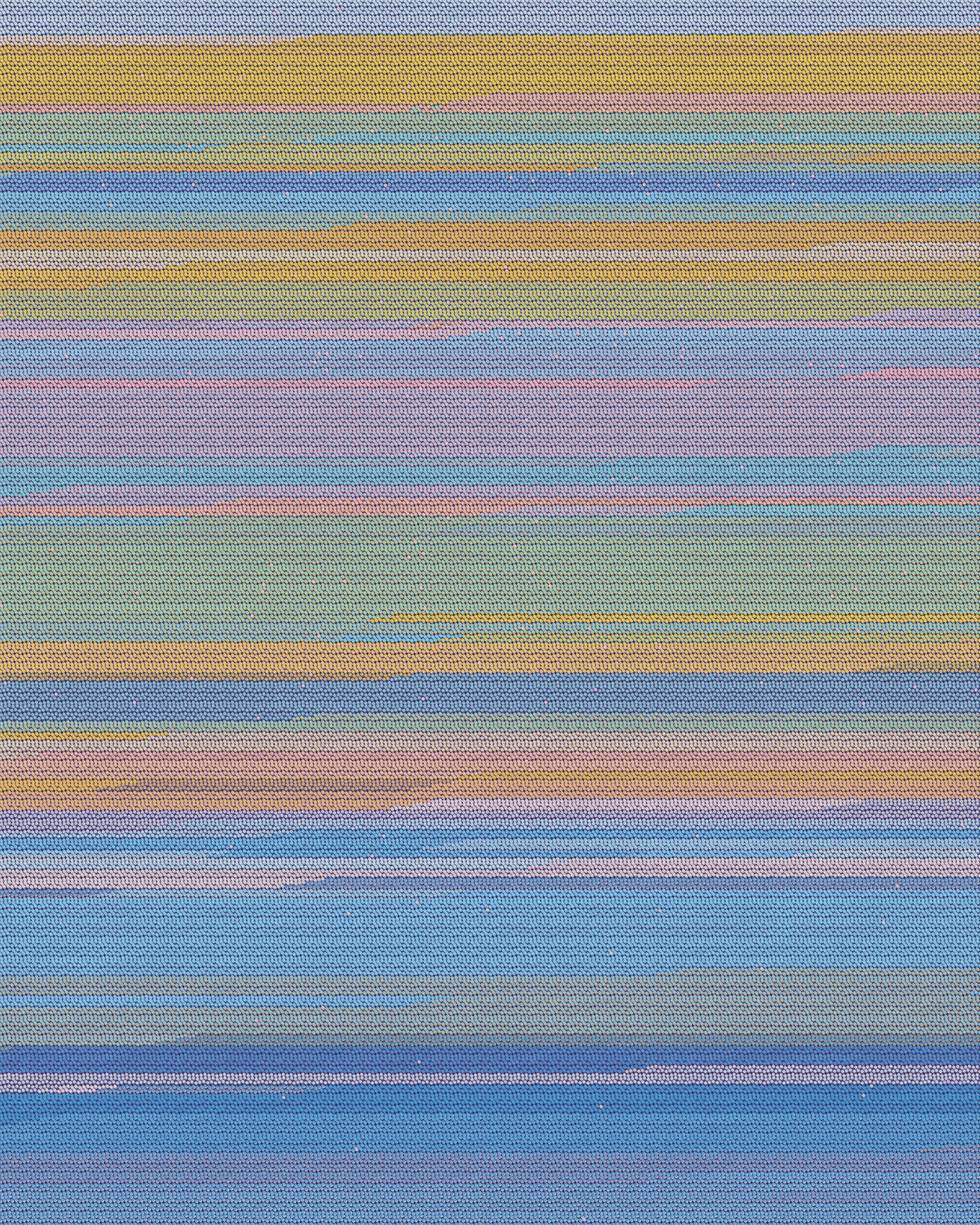
Seattle
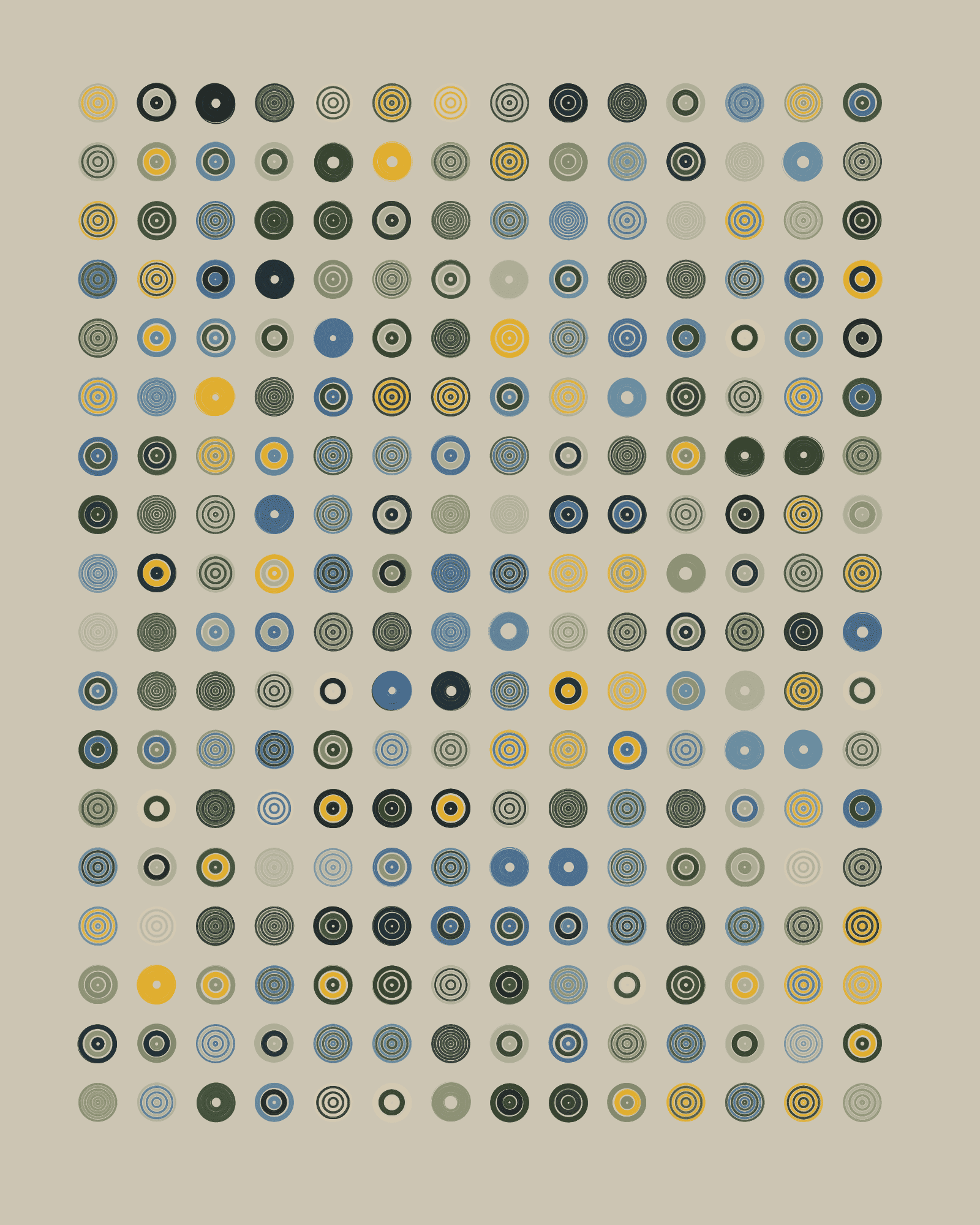

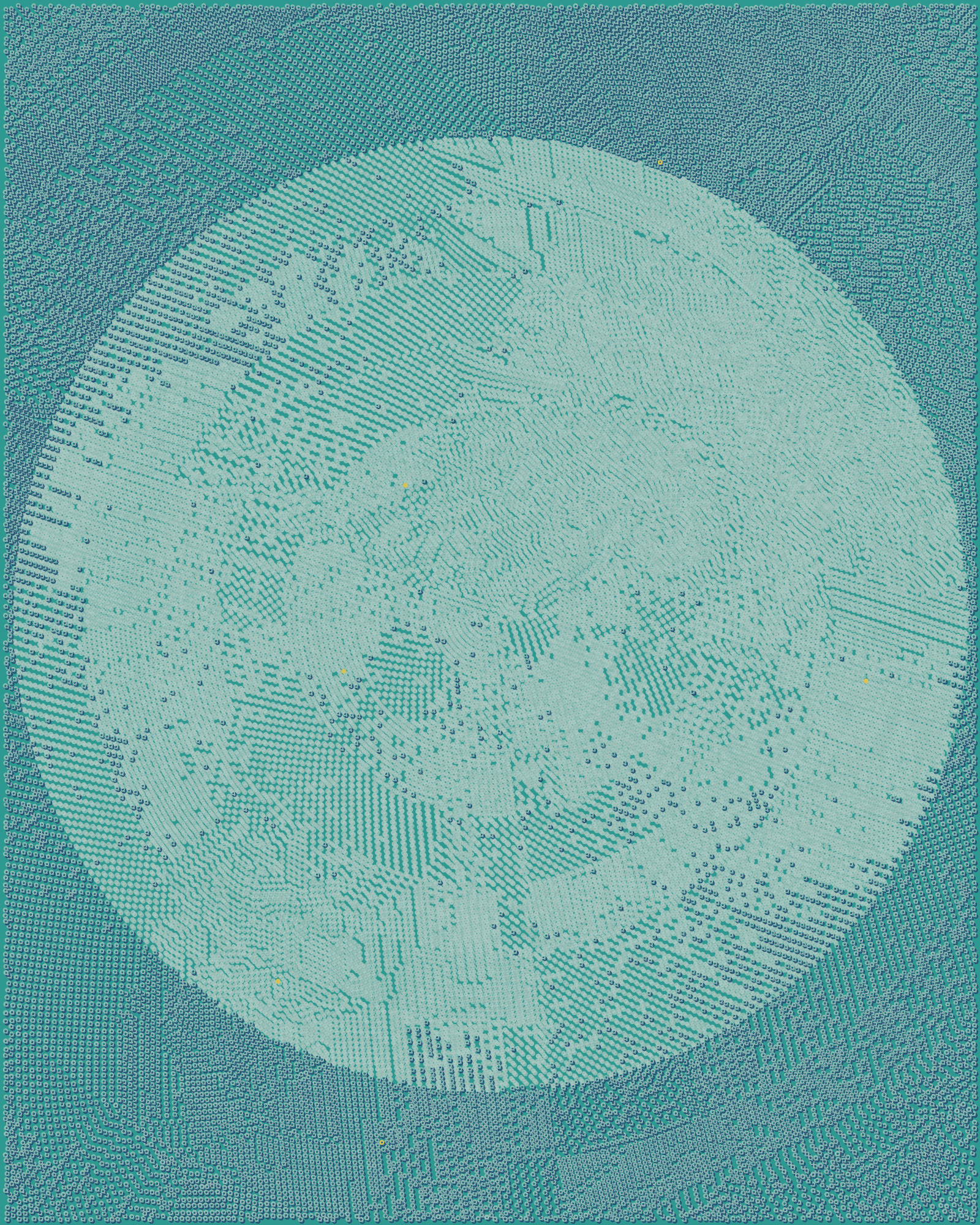
The Seattle palette leans towards a cooler spectrum, incorporating various shades of green and muted blues with accent yellows that stand out over the rest. The grey and soft yellow tones combine to produce a silver and golden metallic vibe while in seeds where blues are most noticeable we discover cool icy images. The overall tone of the Seattle palette is that of serenity, of a quiet introspection evoked by its muted and atmospheric hues.
Seattle works with the duality of light and darkness through its grey backgrounds, where we can find creamy combinations of sandy rings that seem to come out of the dark or texturally rich seeds with an almost natural atmosphere. While maintaining the icy and metallic feeling, the final background, “Seattle Mid Blue,” uses an intense blue base to create a high-contrast effect with yellow or dark rings that stands out from the rest of the seeds generated in Seattle.
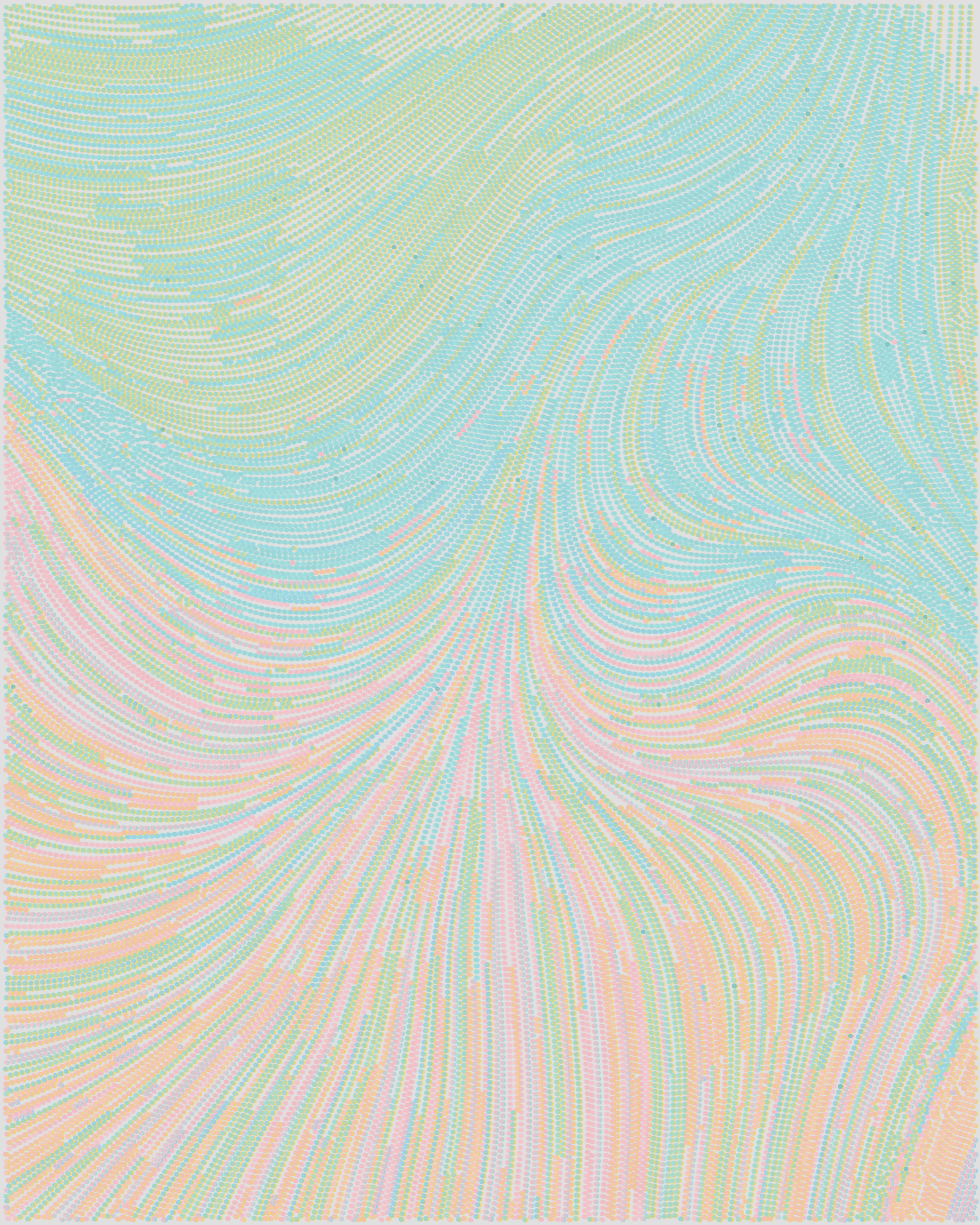
Seoul

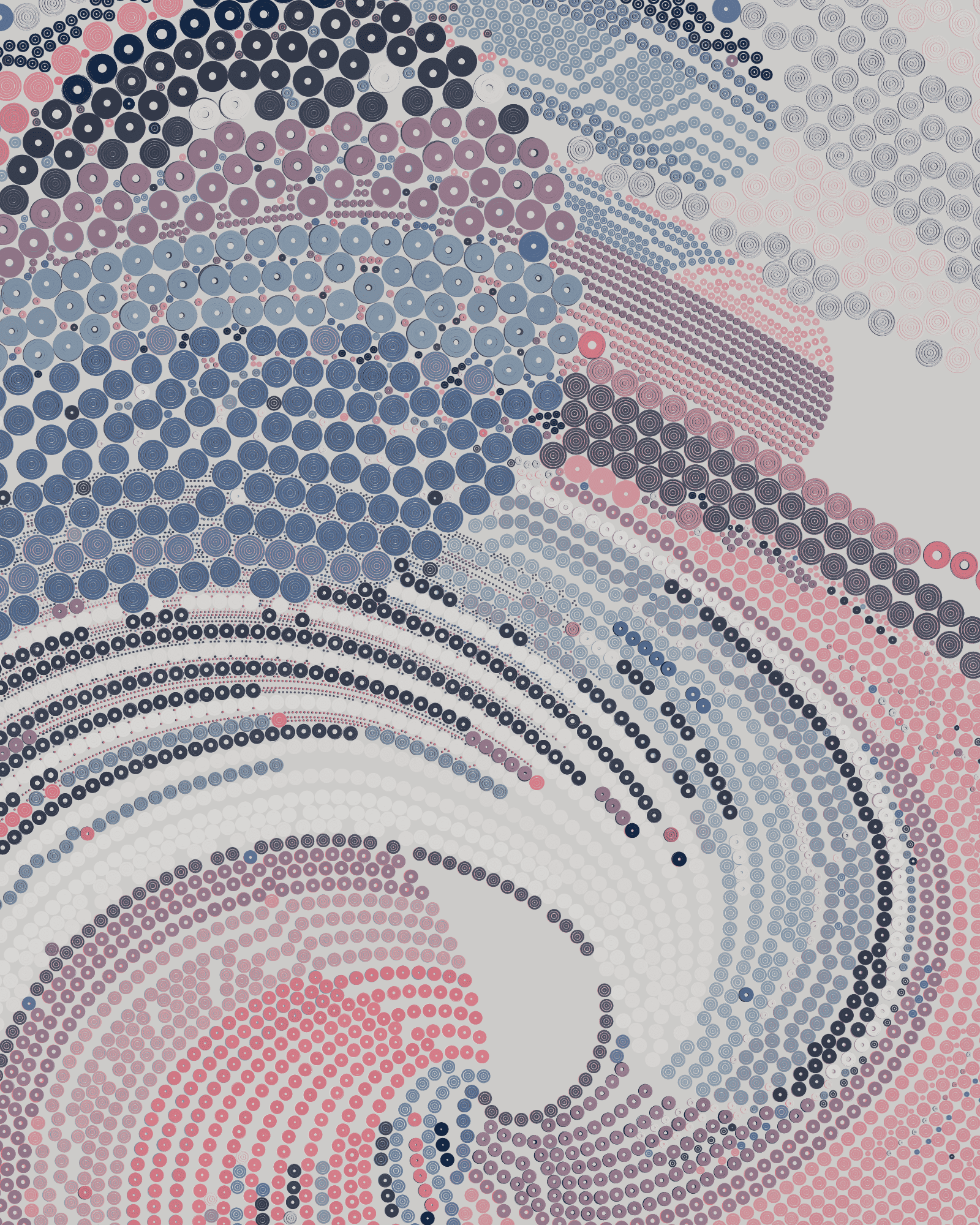
The Seoul color palette, with its tight chromatic arc from blue to pink, is likely the most circumscribed QQL palette, producing very subtle seeds with a very consistently connected color spread. This, paired with low-saturated colors throughout, results in predominantly mauve visuals across all seeds generated.
“Seoul Mid Pink”, both ring and background are the most intense colors available in Seoul and help produce high-contrast seeds when paired with the darker tones of some of the colors available. On the opposite side of the spectrum, we are able to generate very calming outputs when white is the core color of a seed.
Ultimately, each of the seven QQL palettes has their own distinct aesthetics which encompass an incredibly diverse and unparalleled range of color combinations. This gives us the opportunity to endlessly explore and discover the algorithm, going from the multifaceted and extremely diverse Fidenza, through the more visually complex colors of Edinburgh and Austin, all the way to the more targeted palettes such as Miami, Seattle and Seoul.